

Proportion and Balance: How Experts Judge Antique Furniture
Fine antique furniture is rarely fine because of one expensive timber, one carved motif or one celebrated name. Its quality is first expressed through proportion: the relationship between height, width, depth, mass, support and empty space.
An experienced eye reads these relationships before examining construction. A chest may have old drawers and appropriate handles, yet still appear wrong because the feet are too small for the carcass. A table may contain eighteenth-century components but fail as a complete design because its top and base were not conceived together. A chair may carry period carving while its back, seat and underframe pull in different visual directions.
Proportion does not provide an exact date on its own. It reveals whether the object is coherent, whether its parts plausibly belong together and where alterations should be investigated.
Proportion is a relationship, not a formula
There is no universal “golden ratio” that authentic antique furniture must obey. Period, region, function, patronage, available materials and workshop practice all affected design.
A monumental library bookcase and a small country side table should not share the same proportions. Nor should a robust William IV sideboard be judged by the visual lightness expected of a late eighteenth-century satinwood table.
The useful question is not:
> Does this object match one ideal mathematical ratio?
It is:
> Do its proportions make sense within its form, purpose and design tradition?
The assessment must remain historically informed. Good proportion can be bold, delicate, elongated, compressed, architectural or deliberately eccentric. What matters is that the choices are controlled and mutually supportive.
Begin with the whole object
Stand far enough away that the furniture occupies a single field of vision. Do not open drawers yet. Do not let attractive veneer or unusual hardware dominate your attention.
Read:
- overall height against width;
- apparent width against actual depth;
- the relationship between the principal mass and its support;
- the distribution of visual weight;
- the size and position of openings;
- the progression from top to base;
- the amount of empty space beneath and around the object;
- whether one component overwhelms the rest.
A useful first test is to cover parts of the object with your hand or a sheet of paper while viewing a photograph. Remove the cornice mentally. Hide the feet. Ignore the top. If the remaining object suddenly appears more balanced, the concealed component may be a replacement or an unsuccessful later alteration.
This is not proof. It is a disciplined way of locating the problem.
Visual weight is not the same as physical weight
A component can look heavy without being physically heavy. Dark colour, dense carving, broad mouldings, large hardware and strongly figured veneer all increase visual weight. Open fretwork, slender supports, reflective surfaces and generous negative space reduce it.
Fine designers balance these effects.
A broad cabinet may be supported by relatively slender legs if the stand is open and rhythmical. A heavy marble top may require legs with enough visual strength to prevent the table from appearing unstable. An upholstered chair with a large back needs an underframe capable of answering that mass, even where the actual structure is sound.
When later restoration changes colour or removes detail, it can alter apparent proportion without changing dimensions. A heavily stripped base may seem weaker beneath a dark original carcass. Replacement mounts can make drawer fronts appear crowded. Upholstery built too high can shorten the visible back of a chair.
Height, width and depth must agree
Most photographs privilege the front elevation. Experts also examine the side and three-quarter view because depth can expose a false impression created by the front.
Height
Height affects dignity, usefulness and visual centre. Reduced legs can make a chest, table or chair look compressed. Added feet can create an uneasy gap beneath a carcass. A tall cabinet with a reduced cornice may appear to stop abruptly.
Width
Width must be distributed, not merely measured. Door divisions, drawers, legs and applied decoration create a rhythm across the front. Supports positioned too far inward can make the outer edges appear unsupported. A narrow upper section on a broad base may be deliberate; it must still be connected by moulding, setback or architectural transition.
Depth
Depth is structural and visual. A bureau requires room for its sloping fall and interior. A chest must accommodate usable drawers. A dining table must relate to human reach and seating. Later copies sometimes reproduce the frontal design but become implausibly shallow or deep.
Always compare the actual side elevation with the character promised by the front.
Case study: a mahogany chest attributed to Vile and Cobb
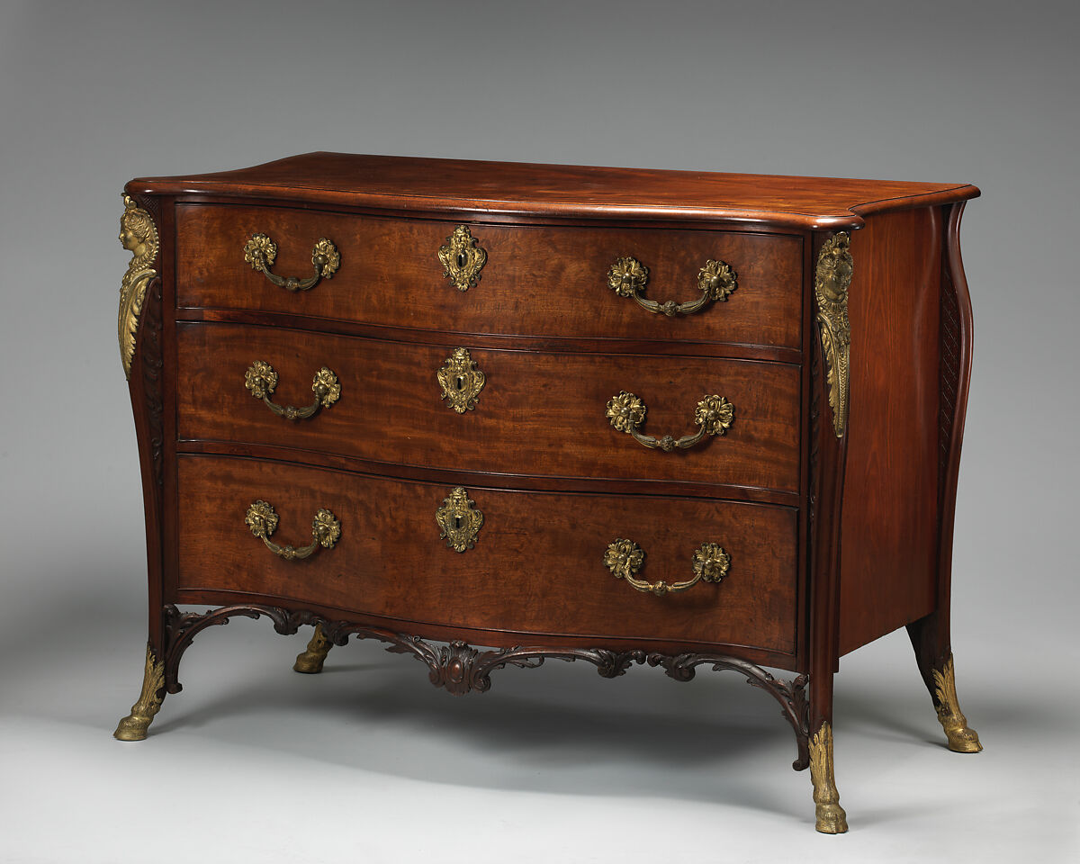
Chest of drawers attributed to William Vile and John Cobb, about 1750. Pine veneered with mahogany and gilt-bronze mounts. The Metropolitan Museum of Art, object 61.242.1. Public domain.
The Met records this chest at approximately 92.7 cm high, 121.9 cm wide and 62.9 cm deep. Those figures are useful, but measurements alone do not explain its effect.
Read the front as a sequence:
- the top provides a controlled horizontal cap;
- the drawer arrangement establishes the principal mass;
- the lower edge transitions into the support;
- the feet complete rather than compete with the carcass;
- mounts add emphasis without destroying the broad drawer rhythm.
The depth—more than half the width—is also significant. A frontal image can make the chest appear flatter than it is. Its physical depth helps account for its solid architectural presence.
When examining a comparable chest, do not simply copy these measurements. Ask whether its own drawer divisions, base and depth create an equally coherent solution.
Tops and bases: were they conceived together?
A replaced top or associated base may be made from old material and still fail the proportion test.
Table tops
Examine overhang on every side. The top should relate to the spread of the legs and the direction of the design. Excessive overhang can make a base appear weak; insufficient overhang can make it look crowded.
Consider thickness as well as area. A thin top may appear insubstantial over a carved base. A heavy replacement slab may suppress a delicate underframe.
Look at edge treatment. The moulding or gallery should continue the design language below. A top that is technically the right size may still be wrong because its edge has a different scale or character.
Case furniture bases
Bracket feet, bun feet, stands, plinths and shaped aprons each create a different relationship with the carcass. Replacement feet are often copied too small, made too short or set in the wrong position.
Look for:
- a base that carries the full visual width;
- alignment between supports and vertical divisions above;
- mouldings that connect rather than disguise;
- sufficient height for the intended period and form;
- consistent surface and wear at junctions;
- old fixing evidence beneath the carcass.
If the base looks wrong from twenty feet away, turn the piece over and find out why.
Drawer graduation and visual rhythm
Drawer arrangements are among the clearest expressions of proportion.
In many chests, drawer depth increases towards the bottom. The progression may be subtle, but it gives the elevation stability: smaller divisions above, greater weight below. Other designs use equal drawers, paired short drawers or a central feature to produce a different rhythm.
Assess:
- the sequence of drawer heights;
- rail thickness;
- spacing around fronts;
- handle scale and position;
- whether veneer or crossbanding reinforces the divisions;
- whether the bottom drawer is cramped by a later base;
- whether one drawer interrupts the sequence.
A replacement drawer can sometimes be identified by proportion before its dovetails are inspected. It may be a few millimetres wrong in height, carry handles at another level or disrupt a sequence of graduating fronts.
Do not expect machine-like equality from hand-built furniture. The question is whether variation belongs to a coherent workshop process or signals a foreign component.
Case study: Chippendale’s china-table design
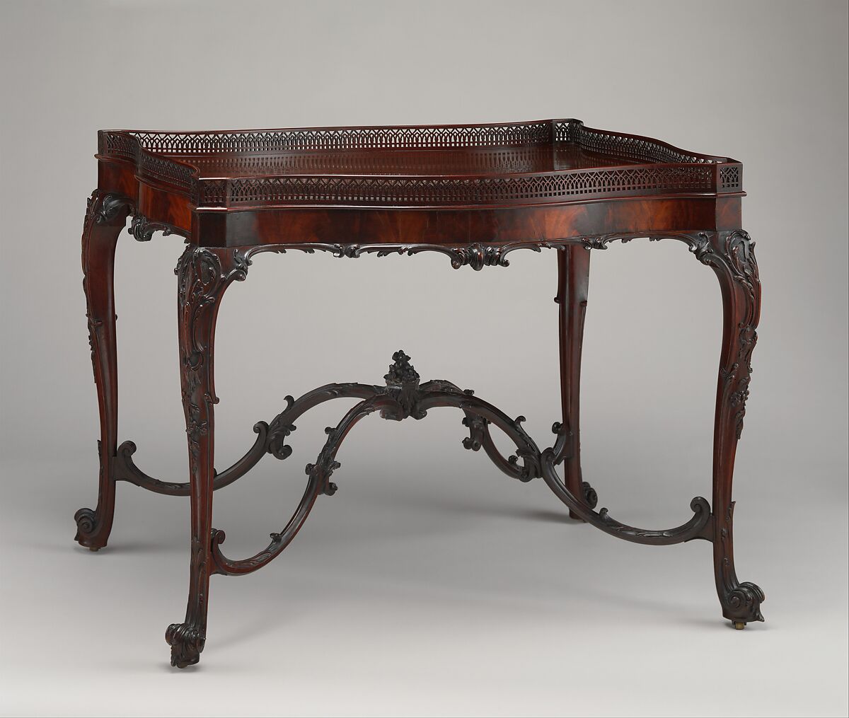
China table after a design by Thomas Chippendale, about 1755. Mahogany. The Metropolitan Museum of Art, object 64.101.1099. Public domain.
The Met relates this table to a design published in Chippendale’s Gentleman and Cabinet-Maker’s Director of 1754. It is recorded at approximately 71.8 cm high, 95.9 cm wide and 67.3 cm deep.
Its proportion is not created by dimensions alone. The delicate pierced gallery, shaped apron, legs and curving stretchers distribute visual interest from top to floor. The open areas are designed as carefully as the timber.
Notice the hierarchy:
- the top and gallery establish the object’s function and outer boundary;
- the apron mediates between top and legs;
- the legs direct the eye downward;
- the stretchers gather the supports into one design;
- the spaces between those members prevent the table becoming visually dense.
If the stretchers were removed, the negative space and relationship between the legs would change. If the top were replaced by a thick slab, the lower delicacy would no longer balance it. Proportion is therefore an interaction between solid material and void.
Negative space
The space between legs, stretchers and structural members is measurable design evidence.
View the furniture against a plain background. Ask:
- Are openings repeated or progressively varied?
- Does a central void align with the mass above?
- Do stretchers divide the space at a convincing height?
- Are supports crowded together?
- Has shortening the legs compressed the open area?
- Does a missing member leave the design visually unresolved?
Negative space is especially valuable when assessing tables, stands, chairs and open bookcases. Later repairs often concentrate on the wood and overlook the original pattern of openings.
Cornices, waists and architectural divisions
Tall case furniture depends on carefully ordered stages.
Cornice
A cornice finishes the upward movement. Its projection and height must answer the width and depth of the case. A replacement can be perfectly well made yet too dominant, too shallow or too plain.
Waist
The waist of a cabinet-on-chest, secretaire bookcase or chest-on-chest is not merely a join. It must connect two masses. Mouldings, setbacks and drawer arrangements manage the transition.
Base
The base must bring the entire elevation to ground. A plinth creates solidity; feet create separation; a stand creates an open secondary composition. The choice changes the character of everything above it.
Where these divisions do not agree, investigate for reduced sections, marriages and replacement mouldings.
Chairs: proportion around the human body
Chair design must balance visual form, structure and the dimensions of a sitter.
Read the chair from the front and side:
- back height compared with seat width;
- width across arms;
- seat depth;
- rake of the back;
- height and spread of the legs;
- relationship between upholstery and visible frame;
- rail and stretcher depth;
- transition from rear legs into uprights.
A high-backed chair may deliberately appear authoritative. A low, wide chair may express comfort and stability. Neither is inherently better proportioned.
Modern upholstery can profoundly distort a period chair. Overfilled seats raise the sitter, conceal rails and visually shorten the back. Thick modern webbing and padding can change the seat profile. Before judging the wooden frame, distinguish original design from later upholstery build-up.
Case study: an armchair after a Chippendale design
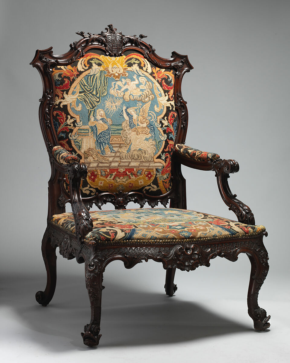
Armchair after a design by Thomas Chippendale, about 1755. Mahogany and needlework. The Metropolitan Museum of Art, object 64.101.980. Public domain.
The Met describes this chair as ambitious in scale and design and records it at approximately 129.5 cm high, 80 cm wide and 83.8 cm deep. Its size is not a flaw. Bold contours, substantial mahogany members and the scale of the upholstery belong to the same conception.
This is an important warning against treating delicacy as the only sign of refinement. Fine furniture can be gutsy and monumental. The question is whether every part participates in that scale.
A later copy might exaggerate the carving without increasing the structural members, producing ornament that overpowers the frame. Another might reduce the width but retain the large crest and arms, creating a compressed version of the design.
Proportion and period
Certain broad tendencies can guide the eye, but none should become a rigid rule.
- Joined seventeenth-century furniture may derive authority from framed architectural divisions and substantial members.
- Late seventeenth-century cabinets on stands often balance a closed upper mass with an open, rhythmical lower section.
- Early eighteenth-century furniture may use controlled curves and increasingly unified transitions between carcass and supports.
- Later Georgian Neoclassicism can favour clearer geometry, tapering supports and refined surface divisions.
- Regency design may combine compact functional forms with strong classical outlines.
- William IV and Victorian furniture can deliberately increase mass, projection and sculptural emphasis.
- Arts and Crafts furniture may make construction part of the visible proportional scheme.
- Modern furniture can reduce members and exploit cantilever, tubular metal, plywood or other technologies to create unfamiliar balances.
Revival furniture may reproduce the features of an earlier period while retaining the proportions of its own time. That tension can be diagnostically useful.
Alterations that change proportion
Common causes of visual imbalance include:
- legs shortened to suit later rooms or repair damage;
- feet replaced after damp or woodworm;
- a marble top substituted for wood;
- a cabinet placed on an associated stand;
- a chest raised on an invented base;
- a bookcase cornice reduced to fit a ceiling;
- table leaves or extensions removed;
- a centre table top cut down;
- upholstery increased beyond the original profile;
- castors removed or replaced with ones of another height;
- a washstand or commode adapted for another purpose.
Some alterations are historic and skilfully executed. They still change what is being dated. Describe the original body and altered elements separately.
When apparently awkward proportion may be genuine
Do not “correct” unfamiliar furniture too quickly.
A piece may appear unusual because:
- it was designed for a particular architectural position;
- its partner or flanking object is missing;
- its original room had a different viewing height;
- it served a specialised function;
- regional convention differs from metropolitan fashion;
- original mounts, cresting, gallery or textiles are absent;
- it was intended to be seen with doors or leaves open;
- perspective in a photograph is misleading.
Research function and setting before declaring an alteration.
Measuring proportion usefully
Measurements support observation but should not replace it.
Record:
- overall height, width and depth;
- maximum top projection;
- carcass height excluding feet or stand;
- foot or leg height;
- drawer-front heights;
- rail and stile widths;
- distance between supports;
- top thickness;
- seat height, depth and width for chairs;
- cornice and base projection.
Then compare ratios within the same object and against securely documented examples of the same form, region and approximate date. Do not create a universal numerical rule from a small sample.
Photography should include a scale and be taken with the camera level. Wide-angle lenses can enlarge the foreground, distort legs and make tops appear deeper than they are.
A practical expert assessment
From across the room
- Identify the principal mass.
- Locate the visual centre of gravity.
- Judge whether support matches apparent weight.
- Read the transition from top to floor.
- Notice any component that dominates unexpectedly.
From a three-quarter view
- Compare frontal width with depth.
- Assess top overhang and the footprint of the base.
- Check whether curves and mouldings continue around the sides.
- Examine the stance of legs and feet.
Close examination
- Measure major divisions.
- Compare drawer graduation and handle placement.
- Look for changes in timber, surface and fixing at junctions.
- Inspect beneath altered-looking tops, feet and bases.
- Decide whether awkward proportion results from manufacture, alteration or missing elements.
Final description
State what the proportions suggest and how physical evidence supports the conclusion:
> “The carcass and graduated drawer arrangement are coherent with a late eighteenth-century chest. The low stance results from later shortened bracket feet, confirmed by cut surfaces and replacement blocking underneath.”
That is stronger than simply saying the piece “looks right” or “looks wrong.”
Final principle
Good proportion is not a mystical quality and it is not a fixed equation. It is the successful relationship between design, structure, function and visual weight.
The experienced eye recognises coherence first. The investigator then explains it. When top, carcass, divisions, supports and empty spaces agree, the furniture reads as one idea. When they conflict, the disagreement tells you where to look.
Research references
- [The Metropolitan Museum of Art: chest attributed to William Vile and John Cobb, about 1750](https://www.metmuseum.org/art/collection/search/202600)
- [The Metropolitan Museum of Art: china table after a design by Thomas Chippendale, about 1755](https://www.metmuseum.org/art/collection/search/203826)
- [The Metropolitan Museum of Art: armchair after a design by Thomas Chippendale, about 1755](https://www.metmuseum.org/art/collection/search/203747)
- [Victoria and Albert Museum: William Kent—designing Georgian Britain](https://www.vam.ac.uk/articles/william-kent-designing-georgian-britain)